Visualizing inclusiveness and diversity
Humanizing Compliance: How a custom visual language turned mandatory training into an empathetic experience.
FOCUS ON UI & DIGITAL BRANDING
THE PROJECT:
Internal teams at the bank were struggling with fragmented resources and a dry, "chore-like" approach to accessibility standards. Our goal was to humanize this mission. We spearheaded the creation of a dedicated digital home for accessibility—one that balanced professional banking standards with a softer, more inclusive visual language. The result was a 100% unified source of truth that shifted the internal perception of accessibility from a compliance hurdle to a vital, empathetic partnership.
PROBLEM STATEMENT:
“Create a resource for training, information, reference materials and
contact points for all internal teams to grow our whole organizations
awareness of accessibility to ensure that everyone can access all of our materials.”
RESOLUTION & IMPACT
We successfully launched a centralized microsite that humanized the bank’s accessibility mission. By creating a distinct "sub-brand" identity, the team was positioned as a vital, empathetic partner rather than a compliance hurdle.
100% of internal teams now have a single source of truth for mandatory accessibility procedures.
Standardized accessibility documentation across 5+ global departments.
MY CONTRIBUTIONS:
Art Direction: Established a softer color palette and bold typography to balance professionalism with empathy.
Custom Illustration: Created a unique illustration style to represent diverse user needs and touchpoints.
UI Design: Designed high-fidelity page layouts and cross-functional design components.
Dev Handoff: Produced all final visual assets and technical deliverables for the development team.
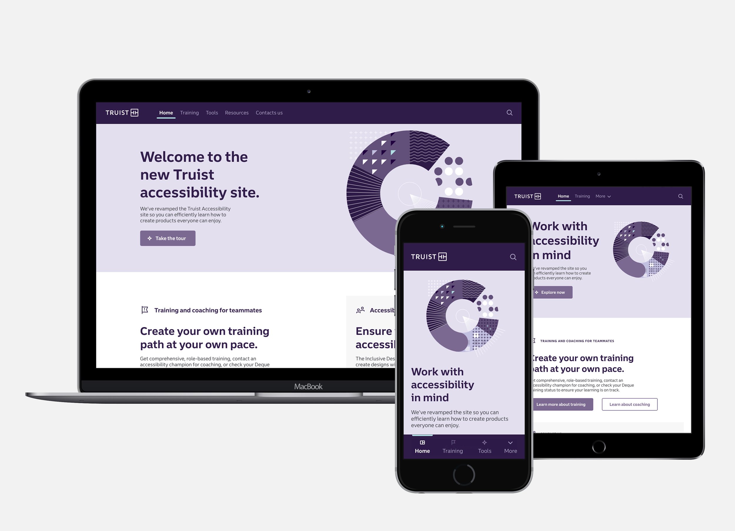
A responsive dedicated digital home for all things accessibility that shifted the internal perception of accessibility from a compliance hurdle to a vital, empathetic partnership.
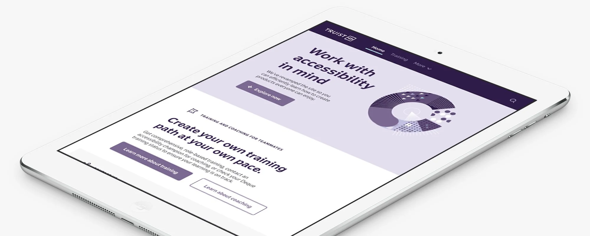
Primary design direction of top level pages
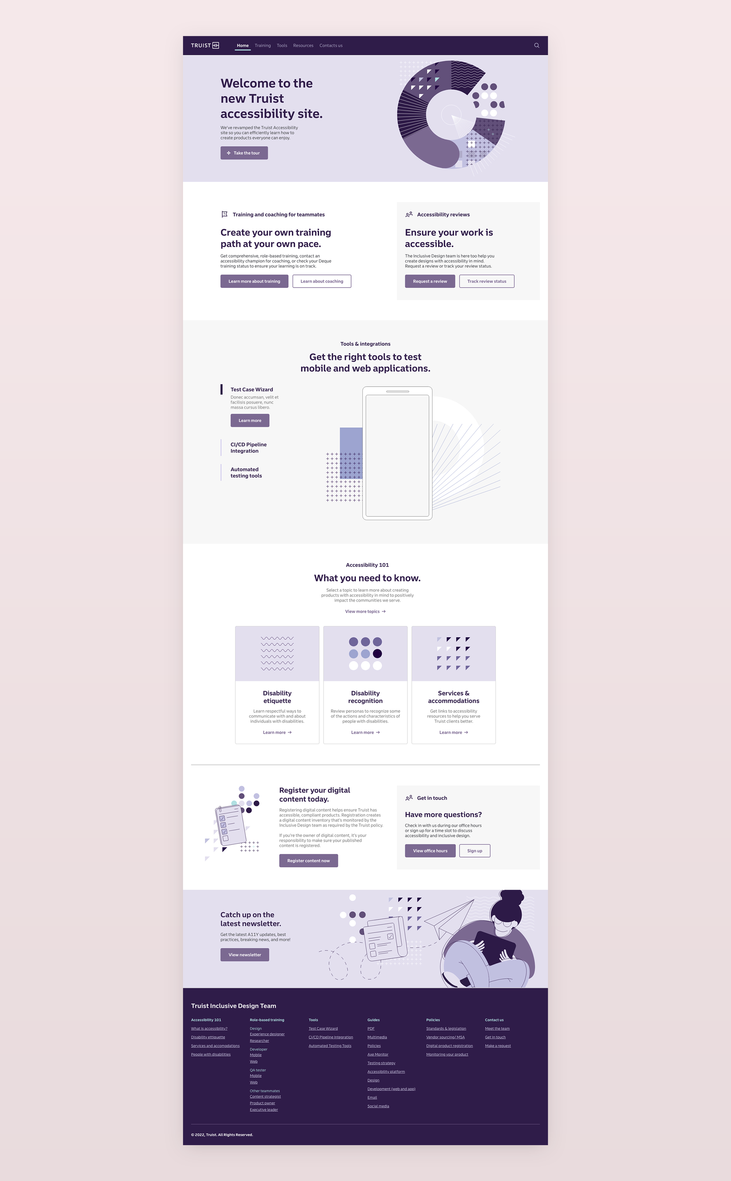
The full homepage experience
THE PROCESS:
Discovery: Audited internal training materials and benchmarked external accessibility microsites.
Collaboration: Partnered with UX, Content Strategy, and Accessibility SMEs to define the Information Architecture (IA).
Creative Strategy: Developed a "Sub-Brand" identity that functioned within the bank’s design system but utilized a unique visual language to signal empathy.
Validation: Conducted feasibility reviews with dev partners to ensure the site itself met the highest accessibility standards (WCAG 2.1).
We started our process by doing internal and external discovery by gaining an understanding of all the trainings, materials and procedures that the microsite had to cover as well as look at what had been created for similar micro-sites at other organizations. We collaborated on the information architecture and structured the content as well as created our first initial creative concepts. After reviewing all these initial deliverables with our accessibility and development partners for feasability and initial approval we continued with the creation of the detailed page designs working through the details of the information and the content.
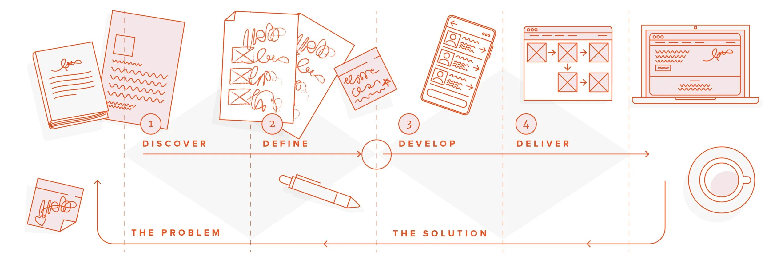
The process
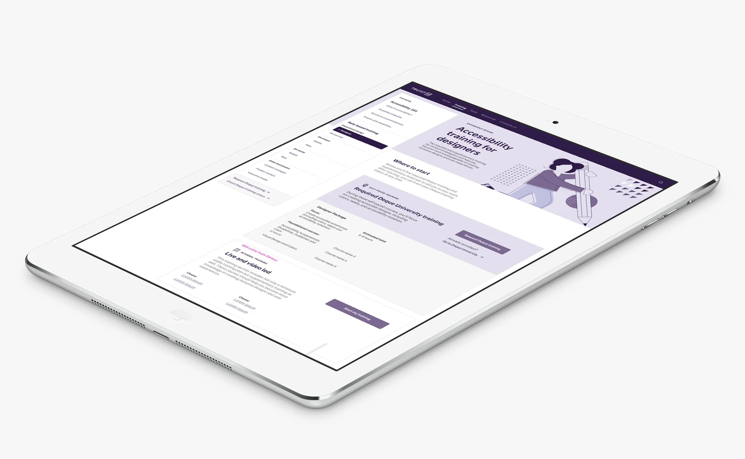
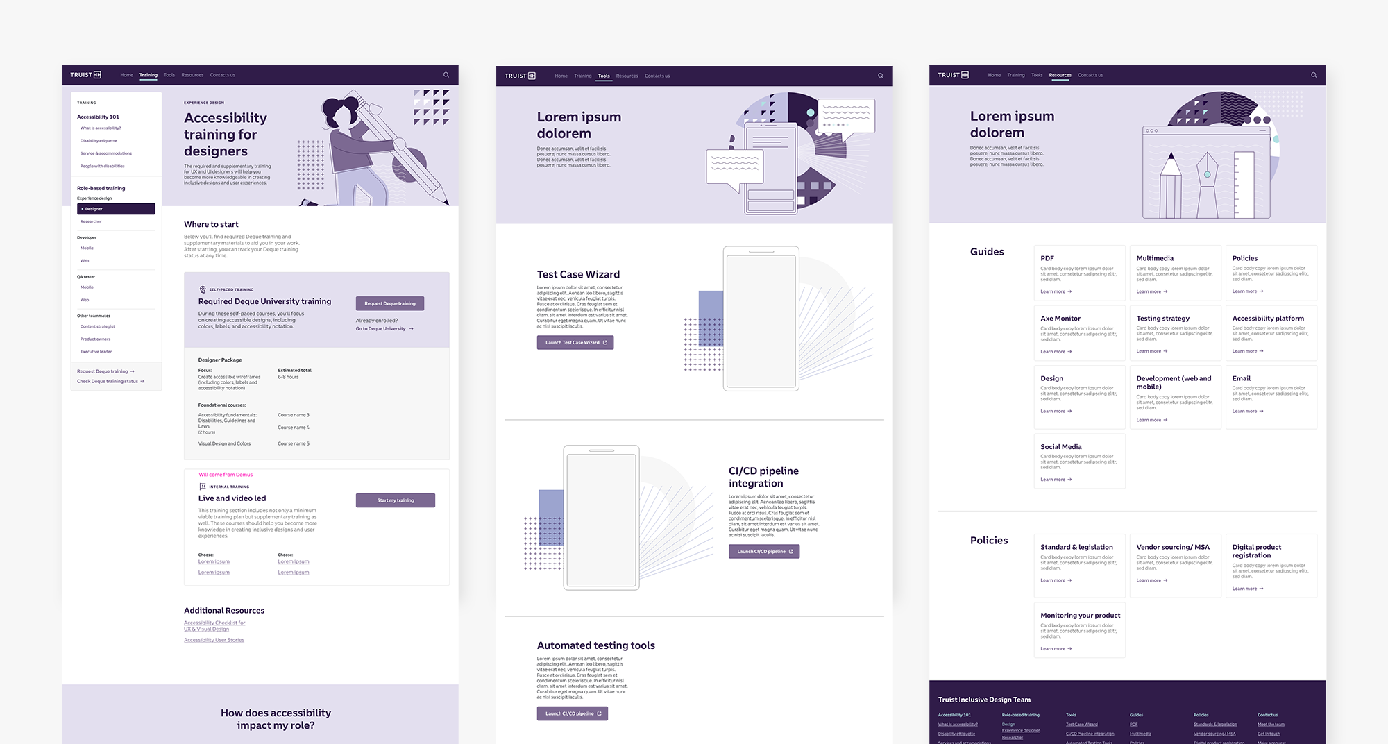
The final training page designs
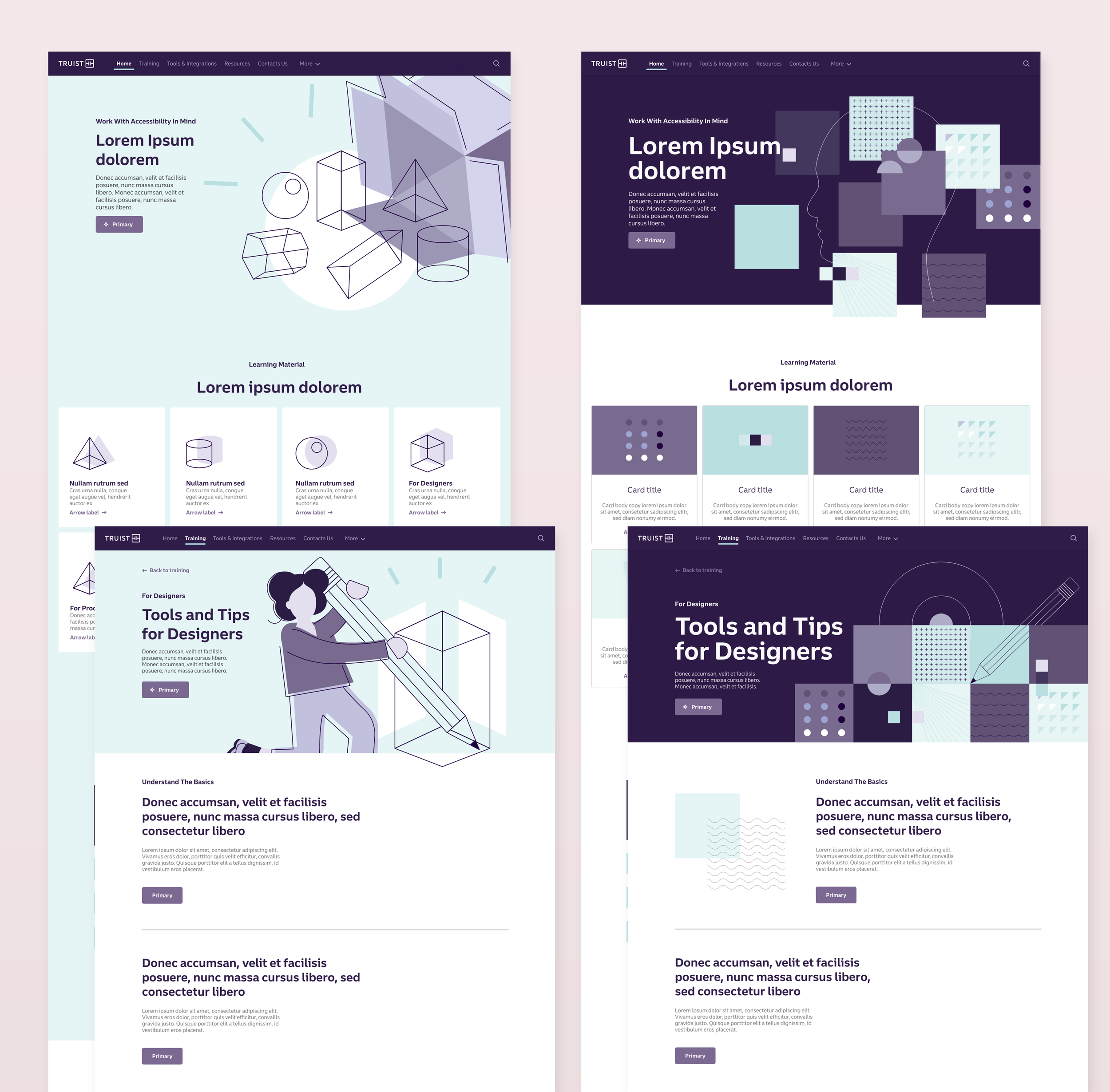
Initial design concepts that were presented and considered